Crowning Beauty Publishing Logo
The Anat Baniel Method decided to form a new publishing company to umbrella the programs, books and products in their line. Here is the development process that led to the final logo.
My first thought was to create a “splash-like” graphic, which looks somewhat like a crown and is certainly a beautiful form. It also suggests motion and fluidity, which are good relative to the client’s general content, and perhaps even suggests ink as well for the publishing aspect. I started in 3D…

And once I arrived at the angle and lighting wanted, I vector-traced the graphic to create the logo idea…
Then making it heavier…
At about this point the client decided against this direction, and I started over with new ideas…
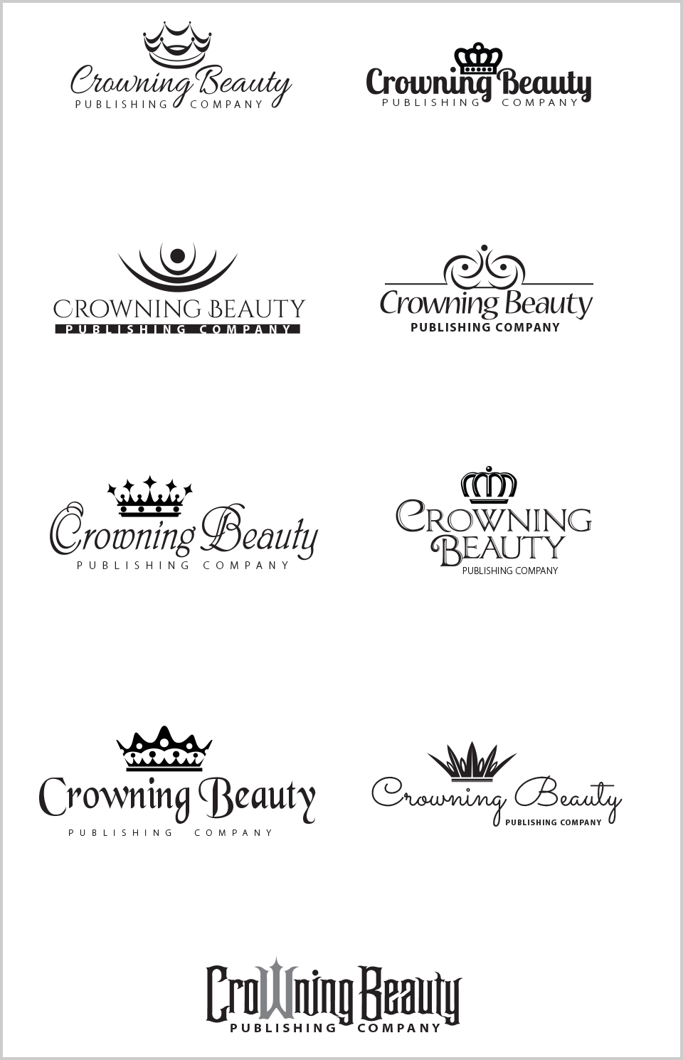
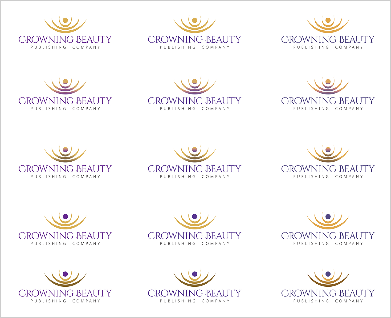
Of these, the client chose one, and we began the refinements, trying various color combinations…
And finally we arrived at the final logo…
